OVERVIEW
DATA HINGE | GOLF AI
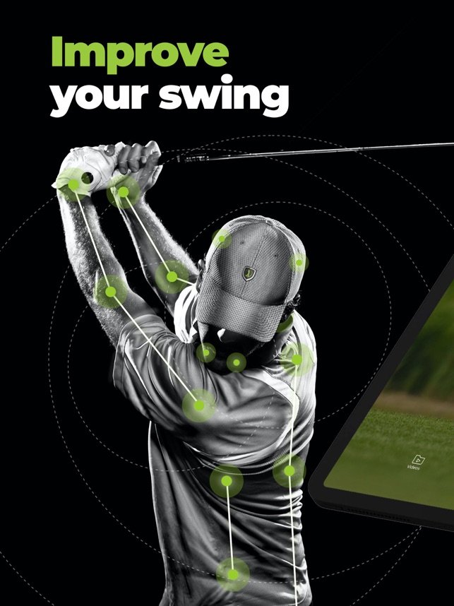
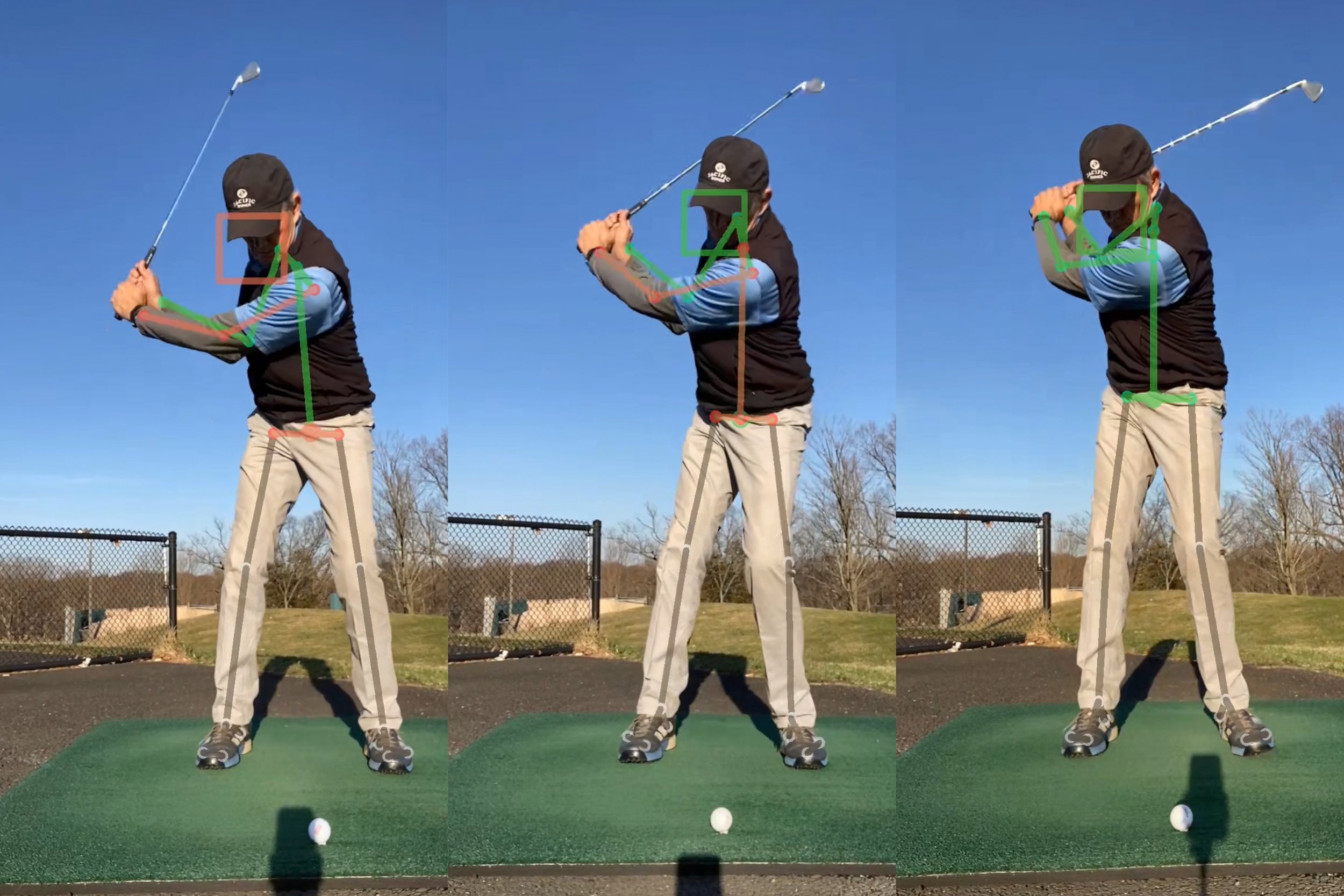
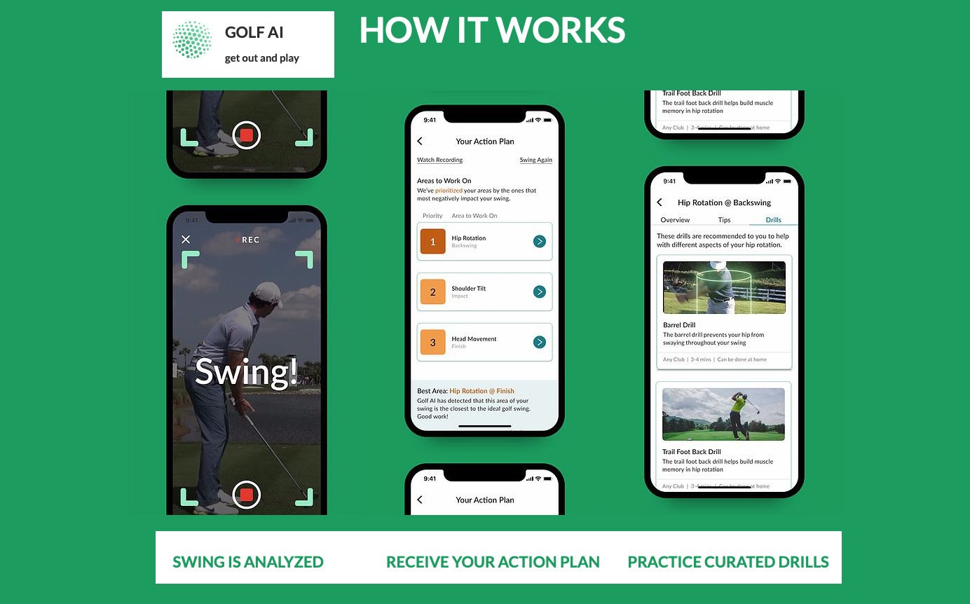
Golf AI was the first mobile app to use artificial intelligence to record, analyze, and improve the user’s golf swing in real time by comparing the user’s form, thousands of data points, and professional athletes.
This project was evaluative human factors research involving usability testing and A/B testing of the mobile app.
MY ROLE
Role: Lead UX Researcher
Team: Golf AI Design Team (A Data Hinge Company)
Timeframe: 2020
RESEARCH QUESTIONS
-
What is the usability of the beta version of the app and its existing features/pages? (Recording a swing, shot input, reviewing swing score, reviewing tips and drills, etc.)
-
Is there any confusion with the flow of screens?
-
How do golfers interpret the UI?
-
What competitor products/services are golfers using?
-
How do golfers feel about the different concepts for app design, color, layout, and features?
USERS
33 total participants
Located in the USA
Age 23-70
Golfers of all levels
METHODS
-
One-on-one qualitative interviews focused on persona-related questions (demographics, background, behaviors, goals, pain points, habits).
-
The usability test required users to interact with the Golf AI mobile app by going through a typical user flow with tasks to complete.
-
The A/B evaluation of UI concepts included various app features, settings, premium plan screens, payment concepts, and in-app icons.
SETTING & MATERIALS
This was a remote study, so participant settings varied. Because the app requires a golf swing to be conducted by the participant, the setting was made to be as close to a typical golf environment as possible.
The Zoom conferencing app, computers, iPhones, iPads, headphones, microphones, cameras, and other recording technologies were used to access the app and record usage. Participants used their personal golf clubs of choice. A/B prototypes were shared through Figma.
INSIGHTS
-
Insights included detailed analysis of competitor products, creation of personas w/ motivations, habits, goals, pain points, etc., analysis of gear items used in various skill levels of golfers, deep understanding and reporting of user errors with app usability, deep understanding and reporting of the “why’s” behind task failures, reporting of feedback about overall concept and design of the app.
-
The following standardized response scoring was used to record participant performance on each task:
Passed (P) = Successful completion of the task without any observed user errors or assistance from the moderator.
Resolved (R) = Successful completion of the task with one or more missteps, mistakes, or apparent difficulty.
Assisted (A) = Successful completion of the task was only possible with some type of assistance from the moderator.
Unresolved (U) = Unsuccessful (incomplete and/or incorrect) completion of the task. Participant was unable to complete this scenario successfully.
-
Participants were shown various UI design concepts in random order through screen sharing.
Participants were asked about their thoughts on the colors used, organization, hierarchy of information, sizing, layout, etc. Follow up questions were asked about each design including how to make each design more intuitive/friendly.
Participants were asked to imagine their ideal scenario for each concept.
ACTIONABLE RECOMMENDATIONS
-
Detailed recommendations were given to help increase the accessibility of the app for diverse user types.
-
Detailed insights were provided to the design team about information hierarchy and annotations within the app.
-
Participants wanted to see more specific ball flight feedback from the AI coaches and this was provided to the product and design teams.
-
Participants wanted to see more diversity with the coaches provided and this was noted.
-
Detailed recommendations were given to the team about how to reach a larger audience, be more relatable, and how to spread awareness of the technology.
IMPACT
New updates to the app with improved usability, accessibility, diversity, and features.
Improvements to the UI flow based on A/B concept feedback.
More social media engagement.
A new website for the company with better UX and visuals.
New color theme in the app and website.
ModGolf podcast participation weekly from the Golf AI founder.
Continued research of the usability and user experience of the product.


